Best Seen plots are best not seen…
Draft of 2012.05.14 ☛ 2015.03.16 ☛ 2016.07.22
May include: GP ↘ visualization ↗ &c.
The Best Seen plot
For decades (literally), evolutionary algorithms (especially genetic programming) have been visualized with “Best Seen plots”, or occasionally “Best-and-average plots”. Simple enough to do, these are just a line chart of the first order statistic of the sample of fitnesses seen so far. Because somebody with some statistical background said something back in the 90s, many Best Seen plots are actually plots of the average of several runs of the evolutionary algorithm, “so as better to compare performance between methods.”
In my experience, very few people have an intuition of how order statistics work. I know I don’t.
First of all, it seems to me that the implicit premise of a Best Seen plot is that the underlying process you’re plotting is iid, and of course we all know that evolutionary algorithms of all sorts converge, and that the distribution of variations often shifts from “exploration” to “exploitation” (and back again, in some cases). So–it seems to me–the thing one wants to see is where that shift arises, the “elbow” of the curve, at least the change in rate of advancement.
If you want to know anything about the “best so far” at all.
More important, at least to me, is the information these Best Seen plots hide. I can’t tell you how many papers I’ve seen where there’s a Averaged Best Seen pile of overlapping hockey-sticks for different test conditions, and the authors spend two or three columns fretting about trying to “explain” what’s happening under various conditions. This just came up at the GPTP workshop last week: Why is the little red hockey-stick curve taller than the blue one in the end, but they cross in the middle? What makes the qualitative behavior of the two treatments differ?
Why don’t you plot the data you’re talking about?
The Piano Roll plot
I’m a big fan of the use of summary statistics (including order statistics, averages, medians, all that junk) for storytelling about the data. For explanatory power they provide, and the theoretical underpinnings that can be useful when the accompanying assumptions are met.
But whenever I am actually trying to explain what’s happening in the course of an evolutionary algorithm’s run, I use a Piano Roll plot. Here’s one I dug up:
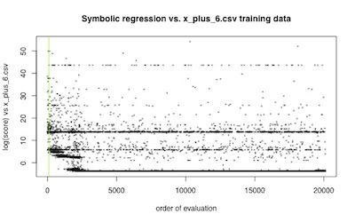
A piano roll, as you know, is a long sheet of rolled paper, into which are cut a series of holes which trigger the keys of an automated player piano or music box. A Piano Roll plot is simply a plot of every evaluated fitness in the order of evaluation.
No summary statistics applied.
I mean look at the information you have there. During the entire course of the run, you can see the “themes” of individuals with log error about 42, and about 14, and about 8. You can see all the actual work being done in the first 2500 evaluations or so. You can see when minor variations make incremental improvements.
What you’re seeing is the real impact your algorithm has on the measured fitnesses.
Do those weird lines at 42, 14 and 8 arise because of the inherent problem structure, or because there is an inherent tendency in the problem’s formulation to randomly produce solutions with that quality?
I can tell you immediately, even though these are results from years ago. You see that green line? That indicates the point where random guessing (during initialization) transitions to active search. We see there are definitely peaks at 42, 14 and 8, and so yes: those lines are perfectly reasonable outcomes of my search algorithm “breaking” better solutions back into their component approximations.
Why does that little stub of a line around log error 3 appear and then disappear?
I can tell you immediately: Actual search is working there. That family of solutions is the real “best seen” in those first 2500 steps or so, but it clearly gives rise to a situation where selection can prevent reversion to that form. Compare it to the long lines that cover the entire time-span, and you can see that in this case the appearance and subsequent disappearance of that variation around 3 is qualitatively different from the one around 12.
Why does the “best seen” curve (the lowest-error solution, in this orientation) have such a tight “elbow” around 2500 steps?
In a Best Seen plot, you would lose all information you might use to explain the dynamics of the “elbow” we see. Here we can see exploitation has stopped by about 2500 steps, and what we’re getting is mainly random search for the remaining 17000 steps or so. How can I say that? Because the rolling histogram of fitnesses, say over 200 steps, would look a lot like the initial random search plus the best solutions found.
Assuming this search is not “finished”—that is, that it hasn’t found the “right” solution—I can tell you immediately what’s happened: we’ve converged to a suboptimal solution.
You couldn’t tell me that with a Best Seen plot. You could guess. But as we begin to use more realistically complicated algorithms your guess is less likely to be useful.
And drawing five or six guesses—five or six Best Seen plots—all on one plot?
Do you want me to interrogate you in public and irritate you and make your speaking engagement a living hell, only to have you look at the data you threw away to answer a reasonable question like mine?
No, you do not. Stop it.
Another example
Here’s another plot from a project I’m working on right now:
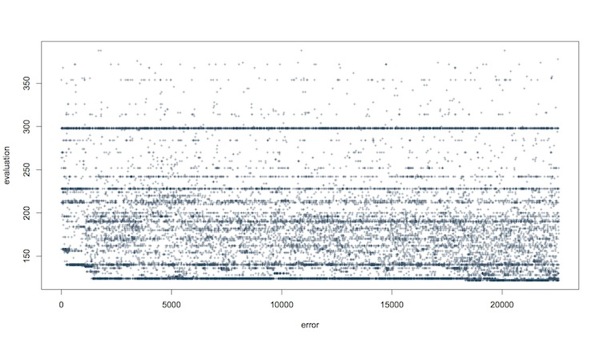
Yes, there are a lot of points. I’m not looking at the points, I’m looking at the behavior of my algorithm in the context of the problem it’s being applied to solve.
I see a lot of things here, mainly in comparison to other problems and other variations of the algorithm. But there’s something I want to point out (I’ve annotated the PDF): around 20000 steps, there is a tiny improvement in the error (you can see the small drop at the lower edge).
But the interesting thing to me—the guy writing the algorithm and hoping to make it work for a given task—is all that activity happening suddenly in “worse” solutions, starting around 18000 steps. A whole slew of new error rates start cropping up in the 130-140 range, which have rarely if ever been seen before in the run.
Where do those come from? I can only infer they’re related to the slightly-better best that appears at the same time. Crossover and mutation products, some favorable matings with what we had on hand.
This is information lost in the Best Seen plot. Explanatory, useful information.
Think about my response to the two forms:
-
If I were watching merely the Best Seen plot as this run was unfolding, I’d see an elbow around 2000 evaluations, and a long plateau. Nothing seems to be changing, even though within the actual population there’s plenty going on under the surface. If I were patient enough, and could have sat and stared at nothing for 17000 evaluations, finally a little “blip” but then nothing better again for a long time. I’d get bored.
-
Since I am watching the Piano Roll plot, I see there was potential for improvement. While the search is running, I am spending time working on a diversity-preserving variation that I hope can introduce “new blood” more often after about 3000 evaluations. About the time I’m done writing that, the Piano Roll shows me not a little “blip” but a qualitative change in the population dynamics around 17000 steps. And I can tell a useful story about that: the long wait was specifically the period when the population was wrestling with coming up with a novel approach to the problem using mutation, not crossover. Further supporting evidence for my idea that more raw materials are needed.
And again, imagine if I had not only looked at the Best Seen plot for one run, but I had run the thing five or twenty or a hundred times and averaged those record curves.
I won’t say the Best Seen plot is utterly useless, because clearly people find enough value in them that they fill the pages of proceedings volumes. But I cannot use one in my work, and nor can anybody else who is trying to solve the problem on which they are searching.
Best Seen plots are, apparently, for telling a very particular kind of story about evolutionary algorithms, in a way that makes the world seem smooth and clean and unencumbered by interesting variety.
The world I work in is contingent. It’s the same one you work in, as it happens. So when you tell me one of those nice smooth stories about the imaginary world, you leave yourself open for me to tell, quite simply, five other stories just as good.
Do not show me your Best Seen plot, unless you have your story down pat.