Palettes by the book
Draft of 2007.05.15 ☛ 2015.03.28 ☛ 2016.07.05
As all the graphic arts teachers I’ve ever had have suggested: pick an image that appeals to your eye, and use colors from that. So.
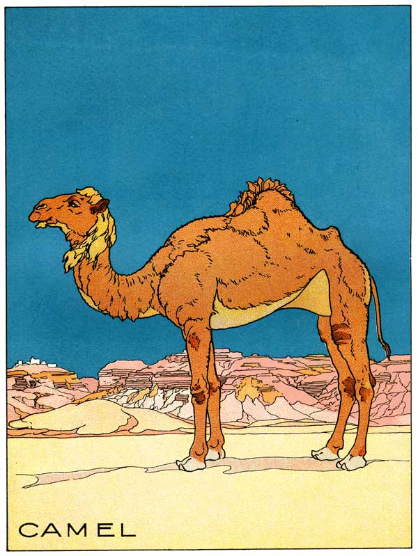
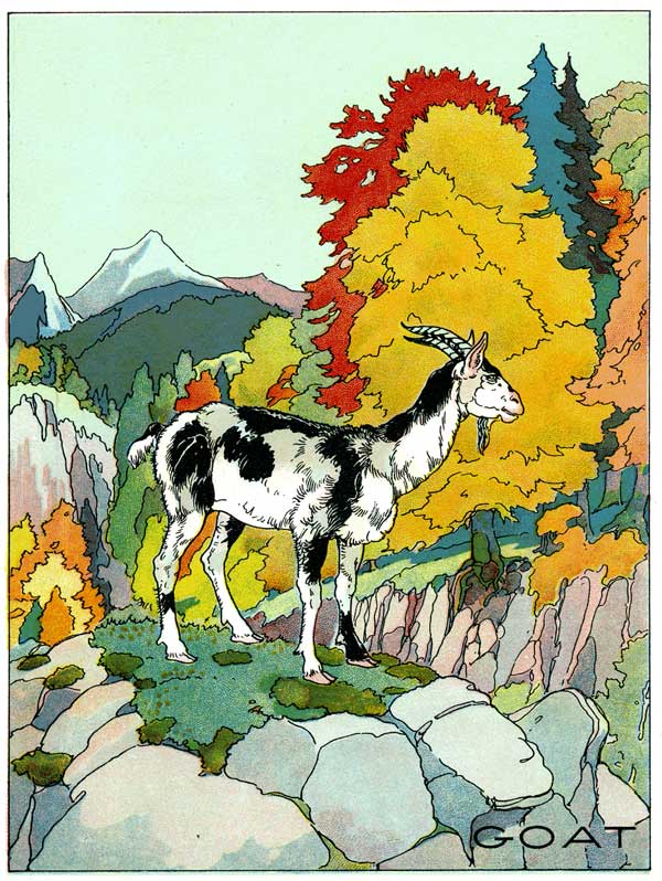
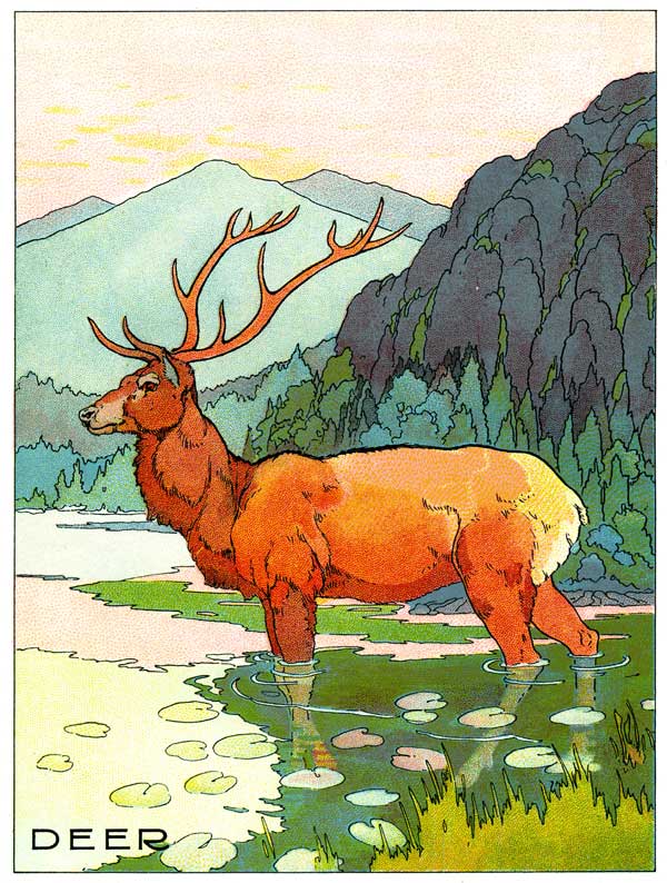
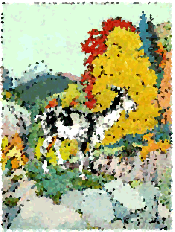
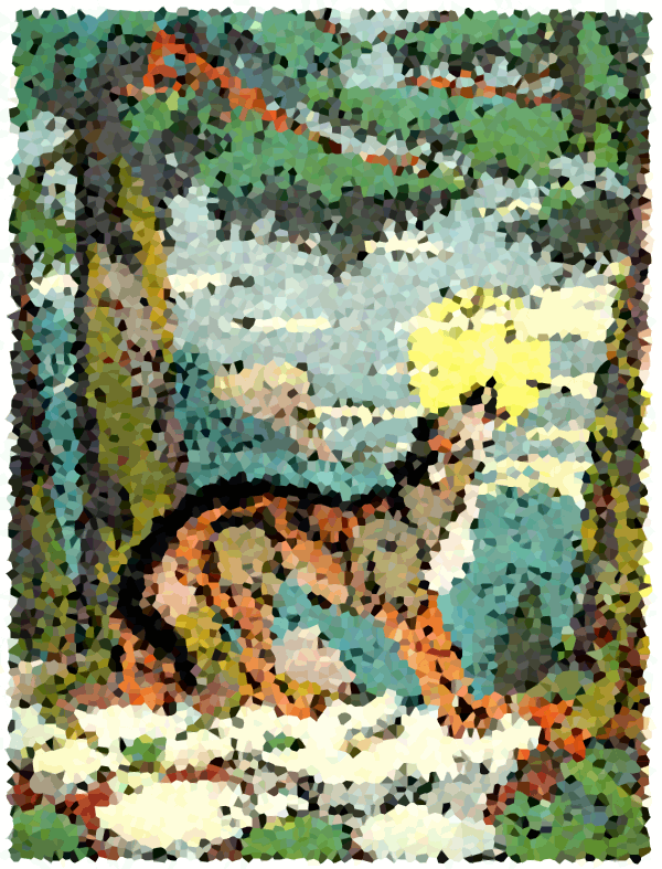
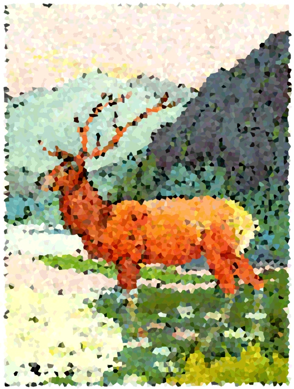
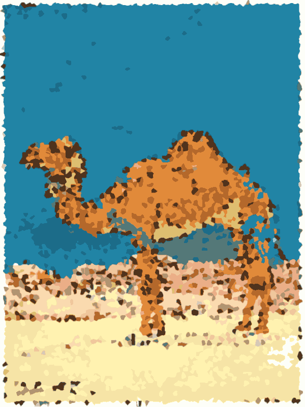
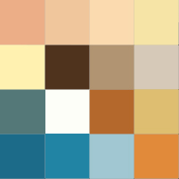
Four images from an old children’s book I scanned and posted here many months ago:
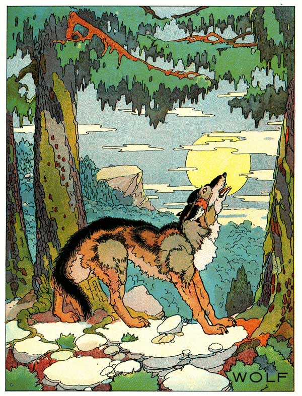
Now the wolf looks a little subtle and fiddly to go through the process, but it might work. Let’s let him tag along.
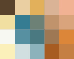
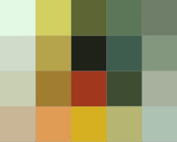
Crystallized, to avoid averaging away the good colors into a muddy wash with the adjacent bad ones:
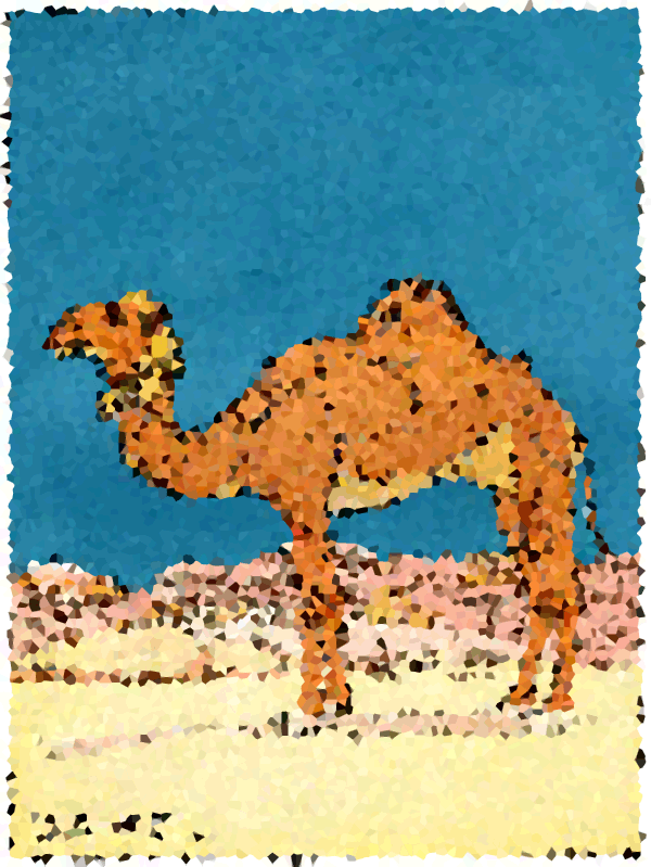
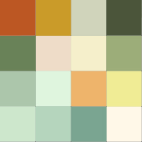
Cutout filter, to spread all the similar pointillist facets into large regions of single colors (again without averaging it all to a brownish gray mush):
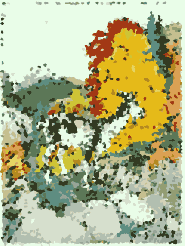
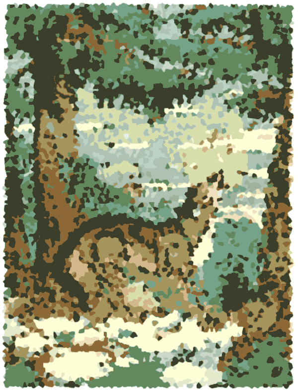
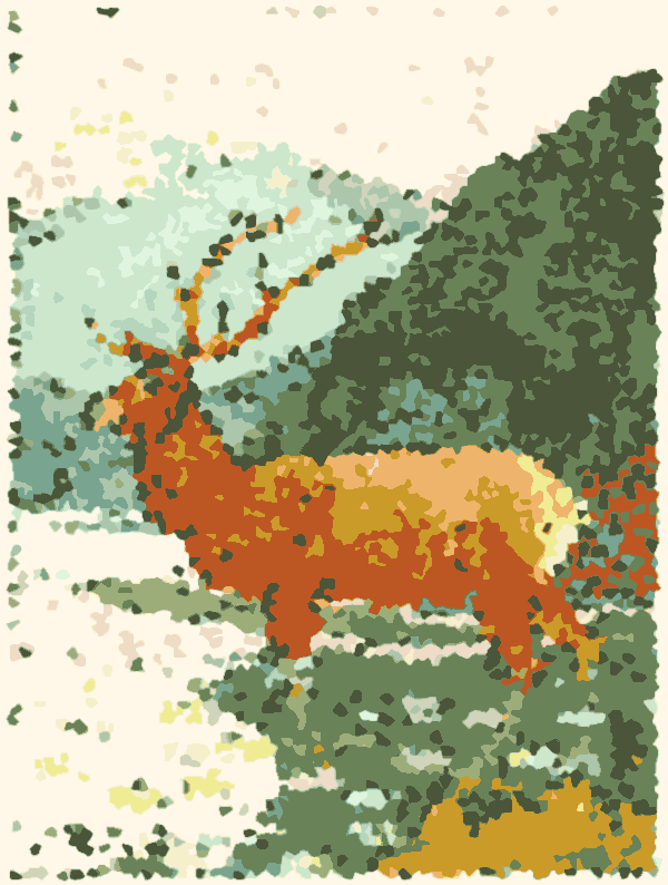
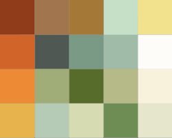
Don’t like the wolf anymore. Too little of the yellow and red, and I think that’s reasonable; I could force them to stick around, but suffice to say it ends up kinda too Xmassy in the end: all sandalwood and teaberry candle colors. Doing some hand-culling and putzing around with the palettes of the remaining three images, and culling to 16 and 20 colors, I got the following palettes:

Soon we’ll know what wins.